What is AmCharts?
It’s a programming library oriented to the needs of data visualization. AmCharts allows us to share the graphics designed in different social networks or insert them into a website.
The MangoUI module includes AmCharts v3 and uses it for most of the chart components.
More about AmCharts, click here
Types of graphics that we can design with AmCharts:
-
columns
-
bars
-
lines
-
zone
-
cake
-
donut or Pie
-
XY
-
bubble
-
Radar
On the website, you can find tools that can help you to choice and design graphics, such as:
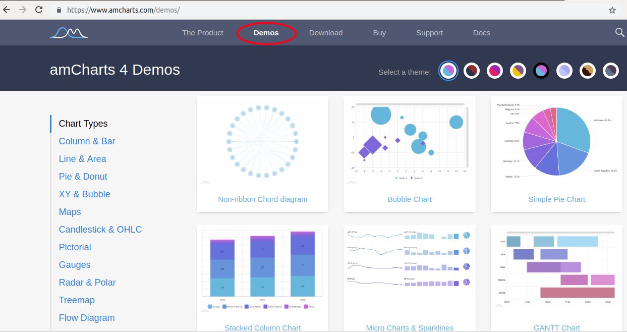
- The Demos option allows you to choose between different types of graphics, from which we can extract the code we want.
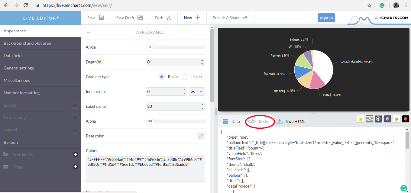
- The Make Chart option offers an online graphics editor, with a friendly user interface, and then we can export the final code of our design.
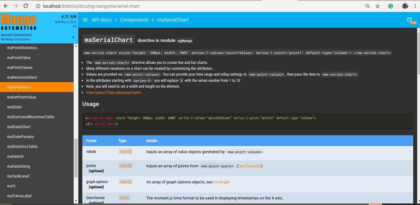
Mango Automation uses maSerialChart and maPieChart components to_supports graphics like line, bars, columns, and pie. We can find these components in the UI menu of Mango Automation -> API docs,_ see the image below).
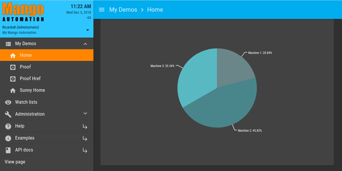
Design of a Pie graphic simple in an HTML view of Mango Automation.
Let’s suppose that is required to represent with a graph the power consumed (in KW) by three machines, we created an AngularJS component, and the view is called “Home”.
Steps:
-
In Mango Automation, configure the data points according to the requirements (one data point by machine)
-
Using the “maPoint” service or “maPointValue” and “maGetPointValue”components, be sure to get the value of each point (this can be verified in the HTML view).
-
In the HTML view, we use the “maPieChart” component:
<ma-pie-chart style="height: 300px; width: 600px" values="values"></ma-pie-chart>
To add the data points values on the values field, you have to:
<md-card flex=80>
<md-card-content class = "card" layout-align="center center" >
<ma-pie-chart
style = "height: 500px; width: 1600px"
values = "[
{
'value' : $ctrl.points.machine1.value,
'text' : 'Machine 1',
'color' : '#6A8689'
},
{
'value' : $ctrl.points.machine2.value,
'text' : 'Machine 2',
'color' : '#48868C'
},
{
'value' : 300 - $ctrl.points.machine1.value - $ctrl.points.machine2.value ,
'text' : 'Machine 3' ,
'color' : '#59B9C2'
}
]"
options = "{ }"
>
</ma-pie-chart>
</md-card-content>
</md-card>
In the “s_tyle”_ field, we change the size of the chart container.
In the “value” field, the values we want to represent have been added, in this case:
$ctrl.points.machine1.value
$ctrl.points.machine2.value
$ctrl.points.machine3.value
The “$ctrl” prefix indicates that a component has been used for the view and, in addition, that the filtering of the points has been done from the “.js” component.
The “text” and “color” fields allow us to assign a name for the legend and the color desired for the graphics area.
The view generated is as follows:
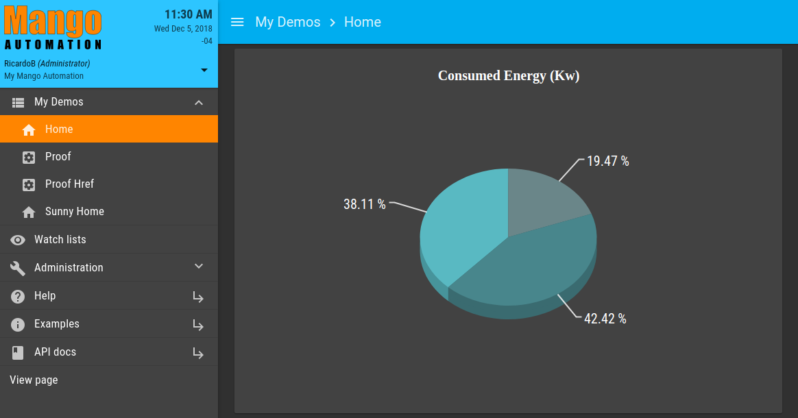
For now, the “options” field is empty. Then, let’s going to add attributes of the AmCharts library, as follows:
options =
  "{
     'depth3D' : 20,
     'angle' : 20,
     'titles' : [
        {
          'text' : 'Consumed Energy (Kw)',
          'size' : 20,
          'color' : 'white'
         }
       ],
     'fontSize' : 20 ,
     'labelRadius' : 50 ,
     'labelText' : '[[percents]] %'
  }"
Description:
-
depth3D : define the model of graph, 2D or 3D
-
angle: inclination graph, in degrees
-
titles: to define the title attribute
-
text: graphic’s title
size: font's size
color: font's color -
fontSize: general font’s size,
-
labelRadius: label distance from the center of the Pie,
-
labelText: set the values, in percentage.
And now, the view is as follows:
Then, we can add more attributes to the options field, as follows:
options = "{
    'depth3D' : 20,
    'angle' : 20,
    'titles' : [
        {
            'text' : 'Consumed Energy (Kw)',
            'size' : 20,
            'color' : 'white'
        }
    ],
    'fontSize' : 20 ,
    'labelRadius' : 50 ,
    'labelText' : '[[percents]] %',
    'legend' : {
        'valueText' : '',
        'align': 'center',
    },
'innerRadius': '30%',
'radius': '20%',
'gradientRatio': [ -0.2 , -0.2, -0.1, 0, 0.05, 0.05, 0.05, 0.05, 0, -0.1, -0.2, -0.2],

'export':   {
    'enabled': 'true'
}

}"
Description:
-
legend: the attributes of the Legends are added and edited inside
-
valueText: as empty ('') suppresses the numeric value of the view of the legends
-
align: legends alignment (center, lef, right)
-
innerRadius: internal radius size, in percentage
-
radius: external radius of the graph, in percentage
-
gradientRatio: Will make bands to fill with gradients of color. A negative value means that the color will be darker than the origi-nal, and a positive number means that the color will be lighter.
-
export: enables the option to export the data represented in the graph (true / false)
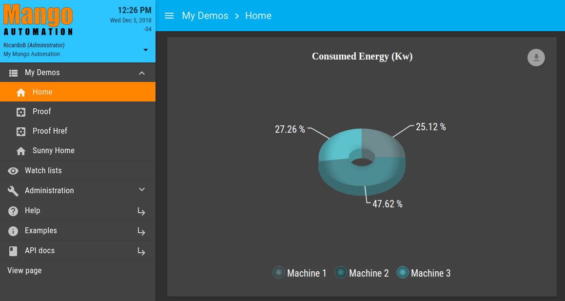
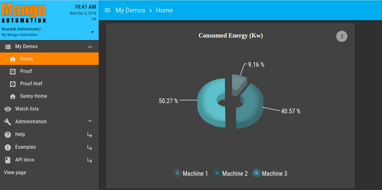
By clicking on the pie slice, the following is achieved:

Now, let’s make our Pie turn 30° modifying the “angle” attribute. Also, let’s change the font size of the legends. The shape and size of the markers will be changed to bubble type. For this, within the “legend” attribute, we add the following elements: markerType; markerSize; markerBorderThickness; as follows:
'angle' : 30,
'legend' : {
    'valueText' : '',
    'align': 'center',
    'fontSize' : 20,
'markerType': 'bubble',
'markerSize': 24,
'markerBorderThickness': 1

},
The final code is the following:
<md-card flex=80>
<md-card-content class = "card" layout-align="center center" >
<ma-pie-chart
style = "height: 500px; width: 1600px"
values =
"[
{
'value' : $ctrl.points.machine1.value,
'text' : 'Machine 1',
'color' : '#6A8689'
},
{
'value' : $ctrl.points.machine2.value,
'text' : 'Machine 2',
'color' : '#48868C'
},
{
'value' : 100 - $ctrl.points.machine1.value - $ctrl.points.machine2.value ,
'text' : 'Machine 3' ,
'color' : '#59B9C2'
}
]"
options = "{
'depth3D' : 20,
'angle' : 30,
'titles' : [
{
'text' : 'Consumed Energy (Kw)',
'size' : 20,
'color' : 'white'
}
],
'fontSize' : 20 ,
'labelRadius' : 50 ,
'labelText' : '[[percents]] %',
'legend' : {
'valueText' : '',
'align': 'center',
'fontSize' : 20,
'markerType': 'bubble',
'markerSize': 24,
'markerBorderThickness': 1
},
'innerRadius': '30%',
'radius': '20%',
'gradientRatio': [ -0.2 , -0.2, -0.1, 0, 0.05, 0.05, 0.05, 0.05, 0, -0.1, -0.2, -0.2],
'export': {
'enabled': 'true'
}
}"
>
</ma-pie-chart>
</md-card-content>
</md-card>
Finally, we have our pie chart with the latest changes: