This is the 4th article of a Dashboard development series. You can check all the articles by clicking here
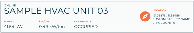
In this article we are going to build a card like the next one:
It will be showed below the map when we select a unit in it (click here to see how to build the map component).
Let's start by creating the selectedUnitCard.js and selectedUnitCard.html files in the components/selectedUnitCard directory.
selectedUnitCard.js
/**
 * @copyright 2020 {@link http://infiniteautomation.com|Infinite Automation Systems, Inc.} All rights reserved.
 * @author Luis Güette
 */
define(['angular', 'require'], (angular, require) => {
'use strict';
class SelectedUnitCardController {
    static get $$ngIsClass() {
        return true;
    }

    static get $inject() {
        return [];
    }

    constructor() {

    }

    $onInit() {

    }
}

return {
    bindings: {
        unit: '<?'
    },
    controller: SelectedUnitCardController,
    templateUrl: require.toUrl('./selectedUnitCard.html')
};

});
selectedUnitCard.html
<md-card>
    <md-card-content>
        <p>Selected Unit</p>
    </md-card-content>
</md-card>
Then, we need to import it in hvac.js module:
hvac.js
/**
 * @copyright 2020 {@link http://infiniteautomation.com|Infinite Automation Systems, Inc.} All rights reserved.
 * @author Luis Güette
 */
define([
'angular',
'require',
'./pages/overview/overview.js',

'./components/map/map.js',
'./components/selectedUnitCard/selectedUnitCard.js',

'./services/unit.js'

], (
angular,
require,
overview,
map,
selectedUnitCard,
unitService
) => {
'use strict';
const hvacModule = angular
    .module('hvacModule', ['maUiApp'])
    .component('hvacOverview', overview)
    .component('hvacMap', map)
    .component('hvacSelectedUnitCard', selectedUnitCard)

    .factory('hvacUnit', unitService);

hvacModule.config([
    'maUiMenuProvider',
    (maUiMenuProvider) => {
        maUiMenuProvider.registerMenuItems([
            {
                name: 'ui.overview',
                url: '/overview',
                menuIcon: 'map',
                template: '<hvac-overview></hvac-overview>',
                menuText: 'Overview',
                weight: 100
            },
        ]);
    }
]);

return hvacModule;

}); // define
And, let's call the hvac-selected-unit-card component in the overview.html file:
overview.html
<div layout="row" layout-wrap layout-align="space-between start">
<div flex="100" flex-gt-sm="50" flex-gt-md="60">
<md-card>
<md-card-header>
<p md-colors="::{color: 'accent'}">Active Alarms</p>
</md-card-header>
<md-card-content>
<hvac-map units="$ctrl.units"></hvac-map>
</md-card-content>
</md-card>
<hvac-selected-unit-card></hvac-selected-unit-card>
</div>
<div flex="100" flex-gt-sm="50" flex-gt-md="40">
<p>Column 2</p>
</div>
</div>
When you reload the page, you will see something like this:
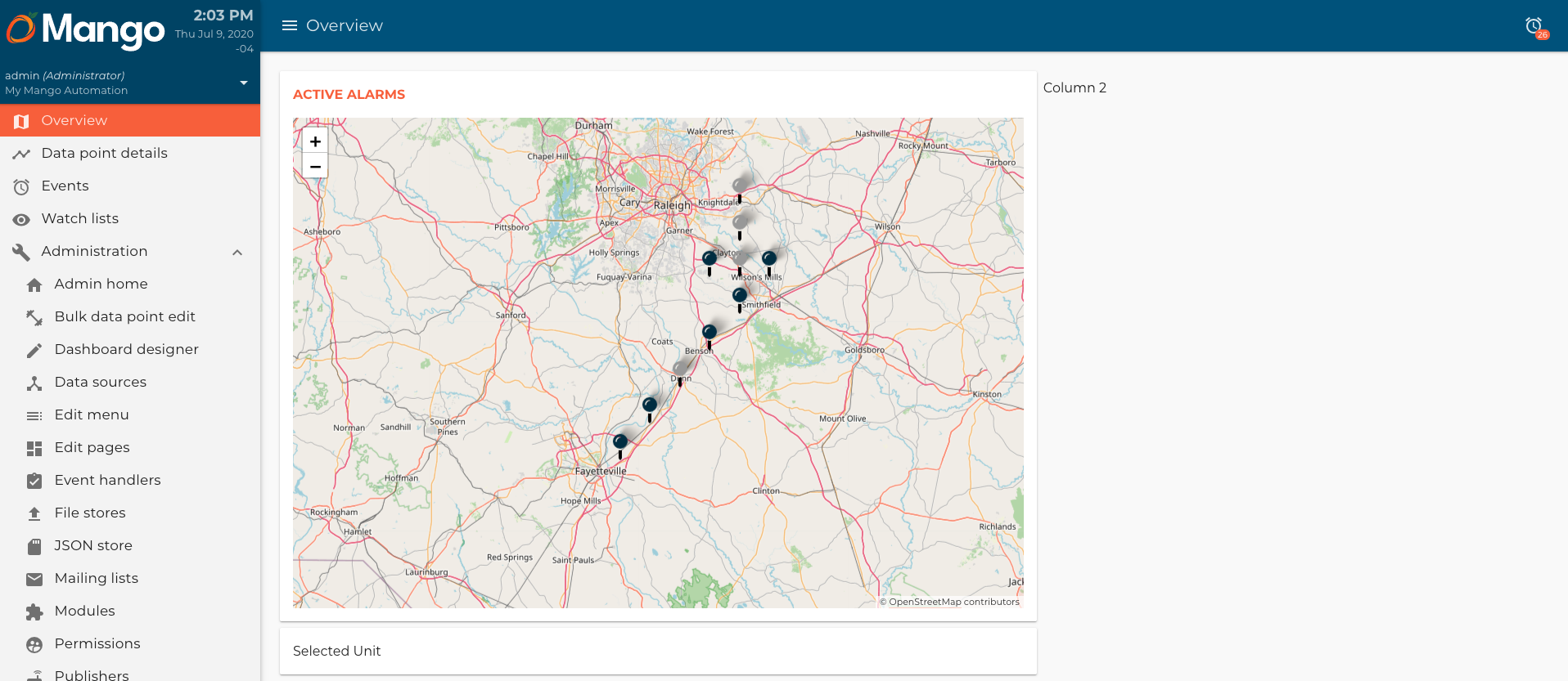
We need to share the selected unit in the map component with the selectedUnitCard component. First, we need to update code on our map component.
map.js
/**
 * @copyright 2020 {@link http://infiniteautomation.com|Infinite Automation Systems, Inc.} All rights reserved.
 * @author Luis Güette
 */
define(['angular', 'require'], (angular, require) => {
'use strict';
const DEFAULT_CENTER = {
    lat: 35.618379,
    lon: -78.413052
}

const DEFAULT_ZOOM = 7

class MapController {
    static get $$ngIsClass() {
        return true;
    }

    static get $inject() {
        return [];
    }

    constructor() {}

    $onInit() {
        if (!this.center) {
            this.center = DEFAULT_CENTER;
        }

        if (!this.zoom) {
            this.zoom = DEFAULT_ZOOM;
        }
    }

    addEventListener(map) {
        map.on('popupclose', event => {
            this.selectUnit(null);
        });
    }

    selectUnit(unit) {
        this.onSelectUnit({unit: unit});
    }
}

return {
    bindings: {
        center: '<?',
        zoom: '<?',
        options: '<?',
        units: '<',
        onSelectUnit: '&'
    },
    controller: MapController,
    templateUrl: require.toUrl('./map.html')
};

});
- We added an
addEventListener()method to set the selected unit tonullwhen onpopupcloseevent. - We added a new callback binding called
onSelectUnit. - We added a
selectUnit()method, which callthis.onSelectUnit({unit: unit})to share the selected unit with the parent component.
map.html
<ma-tile-map
center="$ctrl.center"
zoom="$ctrl.zoom"
options="$ctrl.options"
on-move="$ctrl.center = $center; $ctrl.zoom = $zoom"
>
<div ng-init="$ctrl.onlineUnitIcon = $leaflet.icon({iconUrl: '/rest/v2/file-stores/public/hvacDashboards/img/online-unit.svg', iconSize: [32,32]})"></div>
<div ng-init="$ctrl.offlineUnitIcon = $leaflet.icon({iconUrl: '/rest/v2/file-stores/public/hvacDashboards/img/offline-unit.svg', iconSize: [32,32]})"></div>
<div ng-init="$ctrl.addEventListener($map)"></div>
<div ng-repeat="unit in $ctrl.units track by unit.name">
<ma-tile-map-marker
coordinates="[unit.lat, unit.lon]"
riseonhover="true"
options="{riseOnHover: true}"
icon="unit.points.status.value ? $ctrl.onlineUnitIcon : $ctrl.offlineUnitIcon"
on-click="$ctrl.selectUnit(unit)"
>
<p class="title" md-colors="{color: 'primary-700'}" ng-bind="unit.name"></p>
<div class="data-container">
<div>
<p md-colors="{color: 'accent'}">Occupancy</p>
<ma-point-value point="unit.points.occupancy"></ma-point-value>
</div>
<div>
<p md-colors="{color: 'accent'}">Status</p>
<ma-point-value point="unit.points.status"></ma-point-value>
</div>
</div>
</ma-tile-map-marker>
</div>
</ma-tile-map>
- We call
ng-init="$ctrl.addEventListener($map)"insidema-tile-mapto add thepopupcloseevent listener to the map. - We added a
on-clickmethod to thema-tile-map-marker, so when we click the marker it calls theselectUnit()method and pass the selected unit.
Then, we update the overview component to get the selected unit:
overview.js
...
onSelectUnit(unit) {
    this.selectedUnit = unit;
}
...
- We add
onSelectUnit()method to set theselectedUnitvariable, which will be shared with theselectedUnitCardcomponent.
overview.html
<div layout="row" layout-wrap layout-align="space-between start">
<div flex="100" flex-gt-sm="50" flex-gt-md="60">
<md-card>
<md-card-header>
<p md-colors="::{color: 'accent'}">Active Alarms</p>
</md-card-header>
<md-card-content>
<hvac-map units="$ctrl.units" on-select-unit="$ctrl.onSelectUnit(unit)"></hvac-map>
</md-card-content>
</md-card>
<hvac-selected-unit-card ng-if="$ctrl.selectedUnit" unit="$ctrl.selectedUnit"></hvac-selected-unit-card>
</div>
<div flex="100" flex-gt-sm="50" flex-gt-md="40">
<p>Column 2</p>
</div>
</div>
- We added
on-select-unit="$ctrl.onSelectUnit(unit)"to set theselectedUnit. - We added
unit="$ctrl.selectedUnit"to pass theselectedUnitto theselectedUnitCardcomponent.
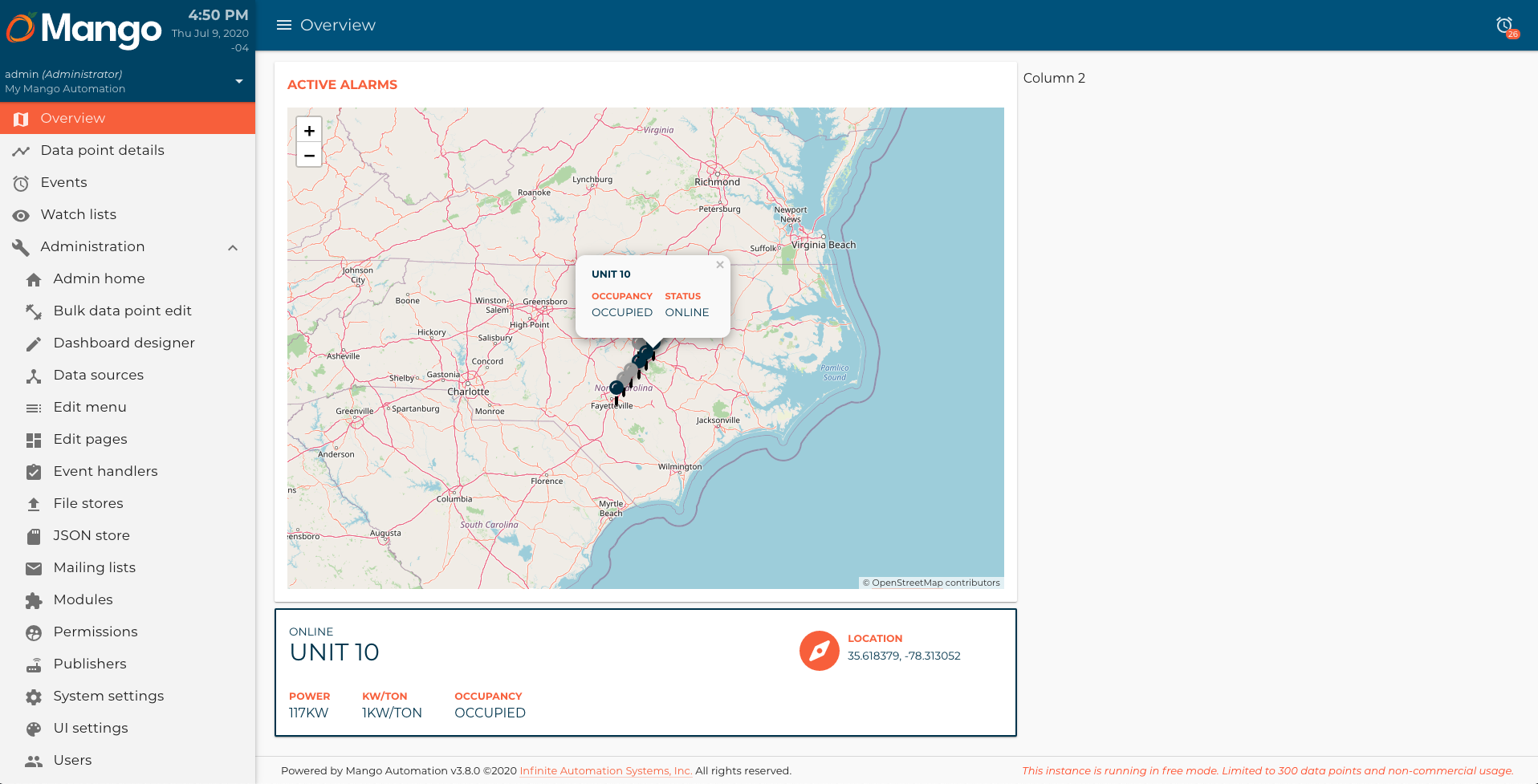
Now that we have the unit information in the selectedUnitCard component, let's add this information, and update the style. You can download the location icon from here.
selectedUnitCard.html
<md-card md-colors="{border: 'primary-700'}">
<md-card-content>
<div layout="row" layout-wrap layout-align="space-between start">
<div flex="100" flex-gt-sm="50" flex-gt-md="70">
<div flex="100" class="title-container">
<ma-point-value point="$ctrl.unit.points.status"></ma-point-value>
<p md-colors="{color: 'primary-700'}" ng-bind="$ctrl.unit.name"></p>
</div>
<div class="data-container" flex="100" layout="row" layout-wrap layout-align="start start">
<div>
<p md-colors="{color: 'accent'}">Power</p>
<ma-point-value md-colors="{color: 'primary-700'}" point="$ctrl.unit.points.power"></ma-point-value>
</div>
<div>
<p md-colors="{color: 'accent'}">kW/ton</p>
<ma-point-value md-colors="{color: 'primary-700'}" point="$ctrl.unit.points.kwTon"></ma-point-value>
</div>
<div>
<p md-colors="{color: 'accent'}">Occupancy</p>
<ma-point-value point="$ctrl.unit.points.occupancy"></ma-point-value>
</div>
</div>
</div>
<div class="location-container" flex="100" flex-gt-sm="50" flex-gt-md="30" layout="row" layout-align="start start">
<img src="/rest/v2/file-stores/public/hvacDashboards/img/location.svg" alt="Location icon">
<div>
<p md-colors="{color: 'accent'}">Location</p>
<span md-colors="{color: 'primary-700'}">{{ $ctrl.unit.lat }}, {{ $ctrl.unit.lon }}</span>
</div>
</div>
</div>
</md-card-content>
</md-card>
Finally, let's add some styles for this component in the hvac.css file:
...
hvac-selected-unit-card {
    text-transform: uppercase;
}
hvac-selected-unit-card md-card {
border-style: solid !important;
border-width: 2px !important;
}
hvac-selected-unit-card p {
margin: 0;
}
hvac-selected-unit-card md-card-content > div {
margin: 0 -1rem;
}
hvac-selected-unit-card md-card-content > div > div {
padding: 0 1rem;
}
hvac-selected-unit-card .title-container ma-point-value {
font-size: 1.375rem;
}
hvac-selected-unit-card .title-container p {
font-size: 3rem;
line-height: 1;
}
hvac-selected-unit-card .data-container {
margin: 1rem -2rem 0 -2rem;
}
hvac-selected-unit-card .data-container div {
padding: 2rem 2rem 0 2rem;
}
hvac-selected-unit-card .data-container p {
font-size: 1.25rem;
font-weight: 700;
}
hvac-selected-unit-card .location-container {
padding: 1rem;
}
hvac-selected-unit-card .location-container div {
margin-left: 1rem;
}
hvac-selected-unit-card .location-container p {
font-size: 1.25rem;
font-weight: 700;
}
hvac-selected-unit-card .location-container span {
font-size: 1.375rem;
}
...
When you reload the browser, you should see a page like this: